Why Classic Colours Change Completely Under Artificial Light
Quick Answer: Light sources emit different mixtures of wavelengths, and a fabric can only reflect what is falling on it — so a colour with no red in the room cannot look warm. Warm indoor lighting flattens navy toward black and pushes camel toward orange; cool LED and fluorescent light drains warmth and turns camel greenish and charcoal blue. Two garments that match in daylight and clash indoors are a metamerism problem, and the only reliable test is to check the pair in the light you will actually be in.
You put the navy jacket with the black trousers by the window, and it looks deliberate. You arrive at dinner and someone’s phone torch catches you, and it looks like you dressed in the dark. Nothing about either garment changed. The room did.

Why does the same fabric look like a different colour indoors?
A colour you see is the part of the available light that a surface reflects back. If the light source contains very little red, a red-based fabric has nothing to reflect, and it appears duller, darker or shifted toward whatever wavelengths are present.
Daylight contains the full spectrum in reasonable balance, which is why colours look truest by a window. Warm domestic bulbs are heavy in red and orange and thin in blue, so blues lose their identity and everything beige-based glows warmer. Cool white LED and older fluorescent light do the opposite — strong in blue and green, weak in red, which is why skin looks tired and camel looks faintly sickly under office lighting.
The technical measure is colour rendering, and cheap lighting scores badly on it. This is not a small effect. A navy coat under a warm bulb can genuinely be indistinguishable from a black one at two metres, which is why the navy-and-black question causes so much argument — both people are right, in different rooms.
And the effect is strongest on exactly the colours a classic wardrobe is built from. Bright saturated colours hold their identity reasonably well. Navy, charcoal, camel, taupe, olive and burgundy — the quiet colours — are the ones built from subtle mixtures, and subtle mixtures are what shifting light dismantles.
Which classic colours shift most, and in which direction?
It is consistent enough to plan around.
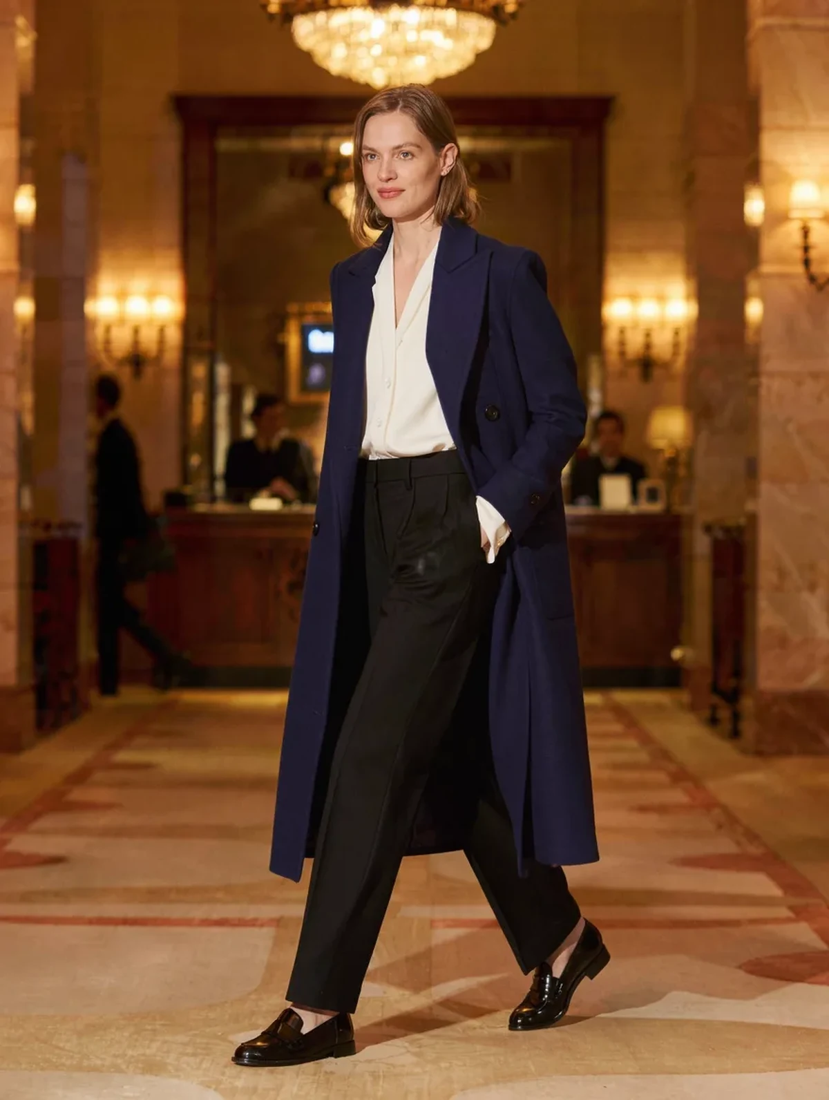
Navy loses to black under warm light. With little blue in the room, a deep navy reads as very dark neutral. In cool light the opposite happens and navy reads clearly blue, sometimes brighter than intended. A navy with a slightly lighter or more saturated tone survives evening light far better than a very deep one.
Camel goes orange in warm light and green in cool light. Camel is a warm neutral with yellow underneath, so warm bulbs amplify it and cool bulbs strip the red and leave the yellow-green. The famous camel coat that looked perfect in the shop and wrong at home is almost always this.
Charcoal drifts brown under warm light and blue under cool light, depending on whether the grey was mixed warm or cool. Two charcoal pieces from different makers can therefore agree in one room and clearly disagree in the next.
Burgundy and deep green darken toward black in low warm light, losing most of what made them interesting — which is worth knowing when choosing something for an evening rather than a daytime event.
Cream, ivory and off-white are the most volatile of all. They have almost no colour of their own to assert, so they take on whatever the room offers, which is why an ivory blouse can look grey in one restaurant and yellow in the next.
Myth vs Fact: Colour and Light
Myth: If two pieces match in the shop, they match. Fact: shop lighting is chosen to flatter stock and is frequently warm and bright. Two navies that match under those bulbs can separate visibly in daylight. Carry the pair to a window or the doorway before deciding — every good shop expects this, and it takes ten seconds.
Myth: Black is safe because black is black. Fact: black fabrics are dyed differently and fade differently, and some blacks carry a brown or blue base that only appears in daylight. Two blacks clashing is more common than navy and black clashing.
Myth: A phone camera shows the true colour. Fact: the camera applies its own white balance, which is a guess at what the light source was. It is genuinely useful for comparing two fabrics side by side in one photo, because both get the same treatment — and unreliable for judging a single colour on its own.
Myth: Navy and black never work together. Fact: they work well when the contrast is deliberate and visible — a clearly lighter navy against a true black, with enough difference that no one could mistake it for an accident. It fails in the narrow band where the two are nearly the same darkness, and that band is exactly where warm evening light puts them.
Myth: Expensive fabric is less affected. Fact: fibre changes how much the shift shows. Matte wool absorbs and stays stable; shiny fabric reflects the light source itself and shifts more visibly. A silk blouse changes colour across a room far more than a wool one at the same price.
How do you dress for a room you have not seen yet?
Assemble the outfit in the light you will wear it in. For a daytime event, choose by a window. For an evening one, turn the lamps on and look in a mirror away from daylight. This is the whole answer, and almost nobody does it.
Keep tone contrast wide when you are unsure. Colours that shift become a problem when two pieces sit close together in darkness — pale camel against cream, navy against black. A clear gap in lightness survives any lighting, because relative brightness changes far less than hue does.
Anchor with one genuinely stable colour. True black, true white and strong mid-tones hold their identity almost everywhere. Building around one of them means only one piece in the outfit is free to misbehave.
Buy the matching piece by bringing the original along. For anything meant to coordinate — trousers to a jacket, a scarf to a coat — take the garment to the shop. Memory for colour is famously poor, and two greys are exactly the case where it fails.
And check autumn outfits after four in the afternoon. From late September the daylight goes early, so the clothes you choose at eight in the morning are increasingly worn in artificial light. An outfit assembled for a bright spring afternoon is being seen, most of the time, in a completely different spectrum by October.
FAQ: Colour and Lighting Questions, Answered
Why do two garments match in daylight and clash indoors?
That is metamerism: the two fabrics reflect light differently across the spectrum but happen to produce the same appearance under one particular light. Change the light source and the underlying difference is revealed. It is more common between different fibres — a wool and a synthetic in the same nominal colour are the classic case.
Is there a lighting condition that shows true colour?
Indirect daylight, such as a north-facing window or an open doorway on an overcast day, is as close as anyone gets. Direct sun is too warm and too bright and washes out subtle tones. If a colour looks right in indirect daylight, it is right, and any other room is an interpretation of it.
Does this mean I should avoid navy and camel?
No — they are classics precisely because they flatter so widely. It means choosing them with a little more care: a navy that is clearly blue rather than nearly black, and a camel with a warm red base rather than a yellow one, both hold their character across far more rooms than the extremes do.
TL;DR:
- A fabric can only reflect the wavelengths present in the room, so warm bulbs flatten navy toward black and cool light turns camel green.
- Quiet classic colours — navy, camel, charcoal, taupe, ivory — shift most, because they are built from subtle mixtures.
- Two pieces that match in a shop and clash at home are a metamerism problem; compare them in indirect daylight before buying.
- Keep a wide difference in lightness between pieces and anchor with one stable colour, and the outfit survives any room.
The outfit that works everywhere is not the one with the safest colours. It is the one whose pieces are far enough apart that no lamp can push them together — and from October onward, most of your clothes are being seen by lamplight anyway.
Keep Reading
This article is for general styling and informational purposes only. Trends, sizing, availability and pricing may vary by brand and season.